Overview
To develop a financial app for UW students and present a more fun
experience to budget finances.
Role
Creative Director & Visual Artist
Deliverables
-
Husky avatar, logo
-
Wireframes / Prototype
Timeline
10 weeks (ongoing)
Inquiry
Objective & Overview:
Financial stress has a huge impact on students, and has a great affect on their mental health and wellbeing. For this project, our team wanted to develop a financial phone application targeted specifically for students of the University of Washington that would help them "play with the idea of budgeting" in a way that is simple and stress-free.
Summary of Interview & Research
Our team talked to several college students. Those who have used financial apps before stated they did not like the complexity of them and find them intimidating to use.
List of Wants (by students)
-
Simplicity and easy usability
-
Incentive to use
-
Aesthetically pleasing / fun
-
Categorization of different expenses / budgeting mechanic
-
Progress reports / spending trends
-
Privacy/security of information
-
Financial resources

Branding
One of the first things I created for the project was a mood board to get a feel of the overall visual look.
Visual Look & Feel Checklist
-
Color Palette — UW colors (Purple, Gold, Gray, White, Black)
-
Visual Design — fun, playful, non-intimidating
-
Modern — clean lines + shapes, sans-serif type (?)
Husky Avatar
What we decided would be the biggest appeal for the app was incorporating an avatar that interacts with the user.
The reason we chose a husky is because it is the official UW mascot. (And also because dogs are generally considered to be cute and non-intimidating)
These are the initial concepts I drew for the application. I played around with a Japanese chibi-styled dog, as well as a more western cartoon look. I refined the look based on feedback from classmates. A mix of the two, with a leaning towards the Japanese cartoon aesthetic, was preferred.


These are the final Husky avatars and their initial digital sketches.
I changed the third expression from upset to confused, since I didn't want users to feel too guilty for not using the app consistently.

Persona Example
A user persona we created called "Samantha" — a typical college student who likes games and struggles financially. She is considered a top priority persona.

User Scenario
A storyboard of a user scenario I created for persona Samantha.
The scenario focuses on what it would be like for a student who has already used the application for a period of time.
Deciding to showcase various expressions throughout the scenario was important to me so people could clearly see Samantha's emotional journey rather than being told what it was.


Wireframes
Low-fidelity wireframes our team created.
What we wanted to keep consistent was having the husky be on every page, so it could provide useful or interesting commentary to read.
Two unique features of the app would be:
-
A resource page tailored specifically for student needs (financial-based)
-
A section to redeem awards given to students for consistent app use (husky avatar customization)

Usability Testing
A picture of our usability testing.
Notable feedback from testers were the varying opinions on how often they would personally use the app and that we would need to adjust the game aspect (aka. how the dog biscuits would be earned) accordingly.
There was also some confusion on which graphics were clickable and how information can be input.
Testers reacted positively to the layout and especially the avatar.
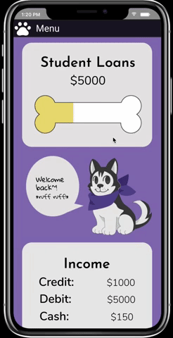
Prototype (1st iteration)
The initial high fidelity prototypes created together by the team.
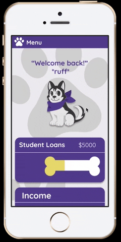
Prototype (2nd iteration)
After taking another look, we decided a redesign of the prototype was necessary. We researched various different financial apps and took notes on the UI design.
A common theme were rounded rectangles to section off different categories of information and having some sort of background element.
Adding paw prints to the background helped fill the white space around the avatar while keeping the look fun. Making the boxes a darker color helped showcase UW's branding more successfully.
Future Goals
With the overwhelming positive response regarding the concept, the team hopes to develop this into an actual tangible working application and resource for UW students to use with the help of the university.
In the distant future, we'd love to explore the possibilities of releasing this product as a white label for other colleges to use.
For now, the team will continue to revise and work on this project as the school year goes on. At the moment we are currently working on initial code development.